Advanced Cartography & Map Design I
BEN HUR S. PINTOR
BNHR
Advanced Cartography & Map Design I
by Ben Hur S. Pintor
version 2020.05
This work and its contents by Ben Hur S. Pintor is licensed under a Creative Commons Attribution-NonCommercial-ShareAlike 4.0 International License.
You are free to:
Share — copy and redistribute the material in any medium or format
Adapt — remix, transform, and build upon the material
Under the following terms:
Attribution — You must give appropriate credit, provide a link to the license, and indicate if changes were made. You may do so in any reasonable manner, but not in any way that suggests the licensor endorses you or your use.
NonCommercial — You may not use the material for commercial purposes.
ShareAlike — If you remix, transform, or build upon the material, you must distribute your contributions under the same license as the original.
Other works (software, source code, etc.) referenced in this work are under their own respective licenses.
Geospatial Generalist. Open Source & Open Data Advocate. Maptivist.
Ben Hur S. Pintor has worn many hats over the years. He received his Bachelor’s degree in Geodetic Engineering from the University of the Philippines and, at the time of this writing, is working towards his Master’s degree in Geomatics Engineering with a specialization in GeoInformatics. His first experience with QGIS was with version 1.5 Tethys in 2010 but he started using it consistently in 2012 with version 1.8 Lisboa. After graduating from university, he worked on several projects where he used and advocated for open source GIS. During this time, he also started providing training and workshops on open source GIS. In 2019, he founded BNHR (https://bnhr.xyz) in order to help people solve data and spatial problems and make better decisions using open technologies like QGIS. He is a QGIS Certified Instructor and currently the only QGIS Sustaining Member in the Philippines.
Learn more about him at https://bnhr.xyz.
Standing on the shoulders of giants.
This workbook is an ever evolving piece of work that reflects my learnings and realizations over the years. The information provided here consists of my own experiences and those that I’ve gathered from the experiences of others from where I have taken inspiration.
The names of everyone I’ve learned from over the years may be too many to mention but I would like to acknowledge the QGIS Project and its volunteers for the Official QGIS Documentation and User Guide and the local and global FOSS4G and QGIS communities among the many inspirations and resources that I had in creating this workbook.
Advanced Cartography & Map Design I 0
What you should already know 5
Creating your own Color Scheme 6
Exercise 1: Creating your own color scheme 6
How would my maps look like when photocopied, faxed, or when viewed by a colorblind individual 14
Exercise 2: Previewing your maps in different modes 14
Exercise 3: Using Blend Modes to Style Rasters 17
Bivariate choropleth maps in QGIS 20
Exercise 4: Bivariate choropleth maps in QGIS 20
Emphasizing density with Feature-level blending 24
Exercise 5: Showing road density using feature-level blending 24
Exercise 6: Mapping Icebergs in QGIS 27
Exercise 7: Generating centroids and buffers using geometry generators 34
Exercise 8: Basic Labelling with Leader Lines 36
Importing Styles into the Style Manager 41
Exercise 9: Importing Styles into QGIS 41
This workbook is designed to teach participants how to use advanced cartography and map design techniques in QGIS focusing on advanced symbology and labelling. By the end of the workbook, you should know: how to use data-defined overrides, geometry generators, advanced labelling techniques, draw effects, blending modes, color palettes, among others. |
As an intermediate level workbook, you are expected to already know basic GIS concepts such as spatial data models and formats and QGIS functions such as loading and styling layers, running processing algorithms, saving QGIS projects, etc. Other learning resourcesOfficial QGIS Documentation (QGIS 3.10) Official QGIS Documentation (testing) Free and Open Source GIS Ramblings by Anita Graser Klas Karlsson’s Youtube channel QGIS User Group Philippines Facebook Page Geographic Information Science Philippines Facebook Page |
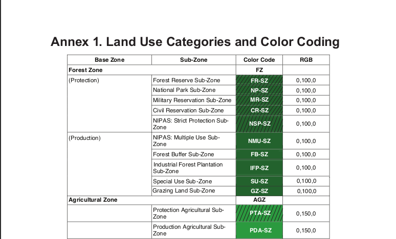
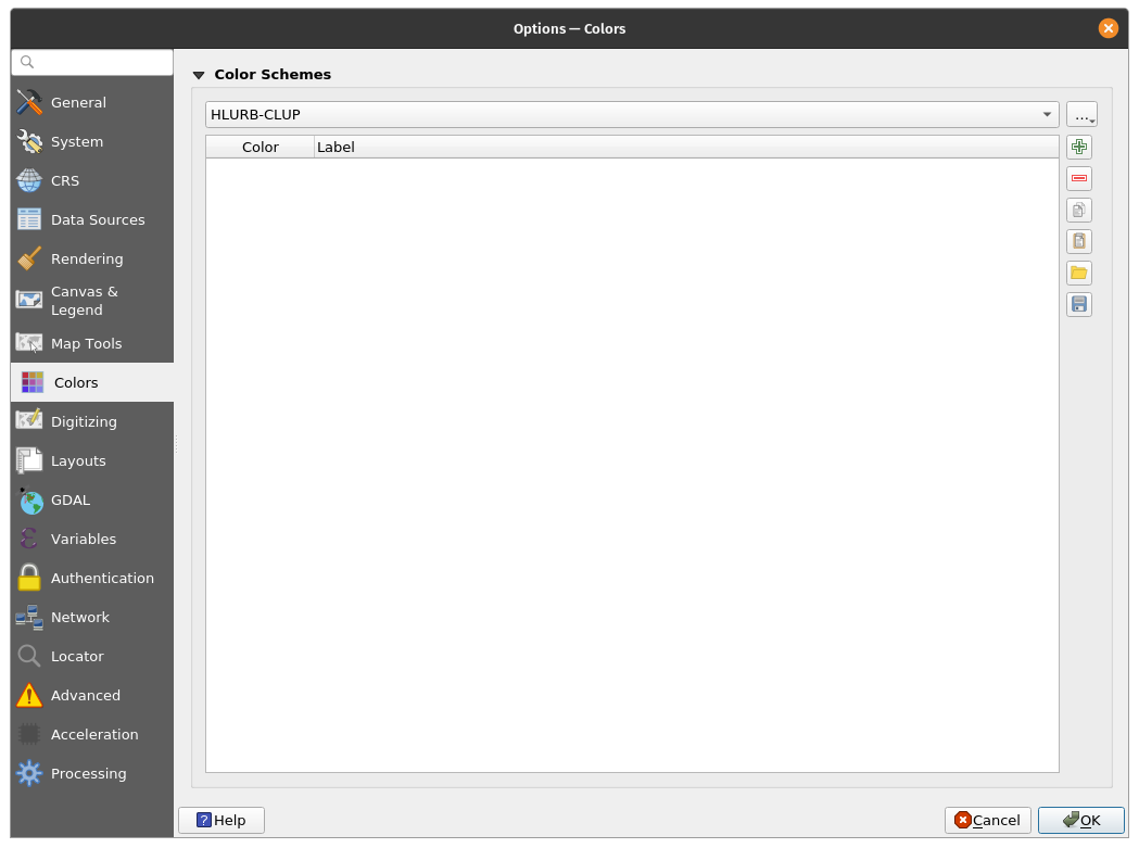
Creating your own Color SchemeQGIS allows you to create your own color scheme or color palette that easily gets integrated into QGIS’ built-in color selection dialogs. This is useful when you have a set of colors that you usually work with (i.e. branding) or if there are standard colors for the maps that you are creating (i.e. HLURB Land Use and Zoning Standards). Exercise 1: Creating your own color schemeIn this exercise we will create a new color scheme in QGIS that reflects the HLURB CLUP Guidebook Annex on Land Use Categories and Color Coding (HLURB_CLUP_Vol_3_Annex_1.pdf). | |
Figure 1. HLURB Land Use Categories and Color Coding sample | |
| |
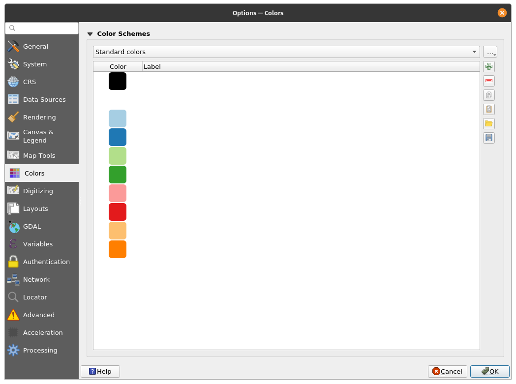
Figure 2. Colors Options in QGIS | |
| |
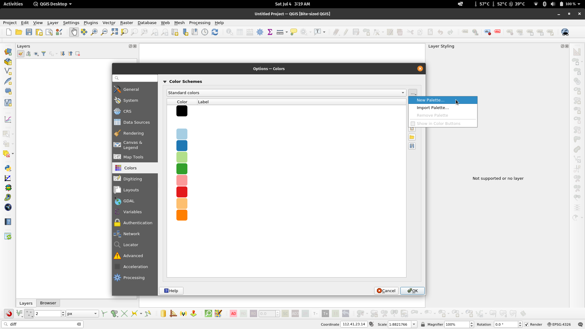
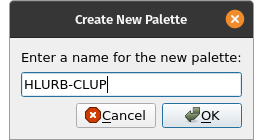
Figure 3. Create New Palette Figure 4. Name the New Palette | |
| |
Figure 5. Blank HLURB-CLUP Color Scheme/Palette | |
| |
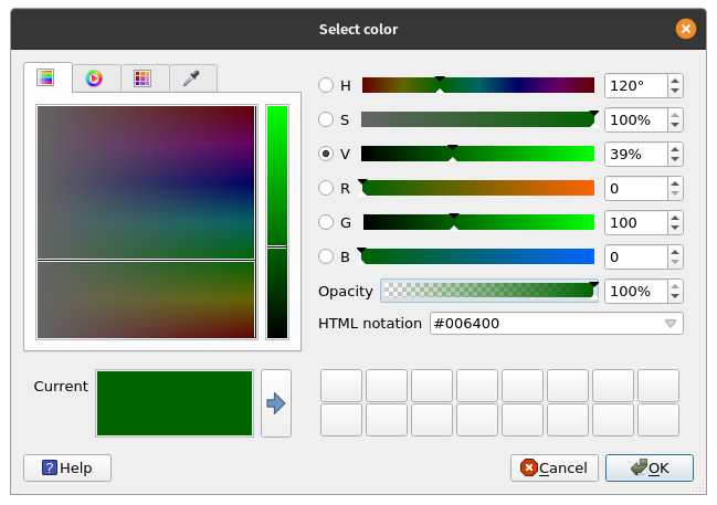
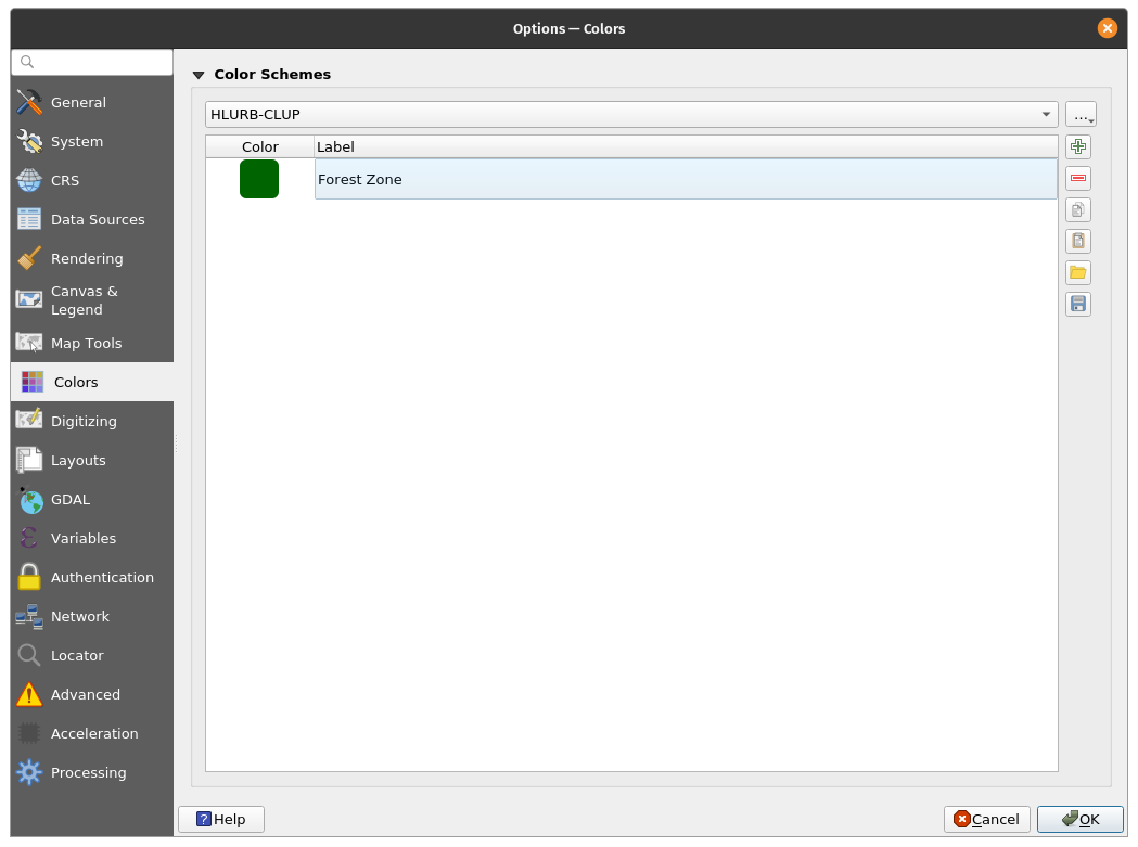
Figure 6. Add the Forest Zone color (RGB 0, 100, 0) Figure 7. The Forest Zone color added to our Scheme/Palette | |
| |
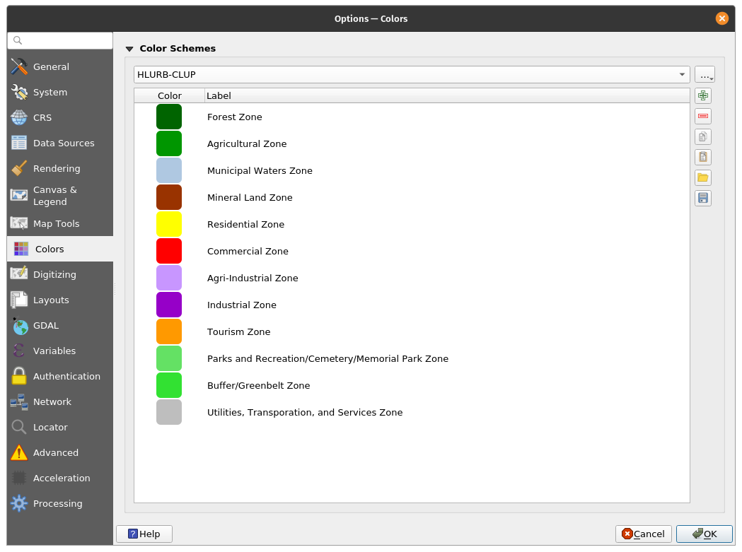
Figure 8. The HLURB-CLUP Color Scheme/Palette | |
| |
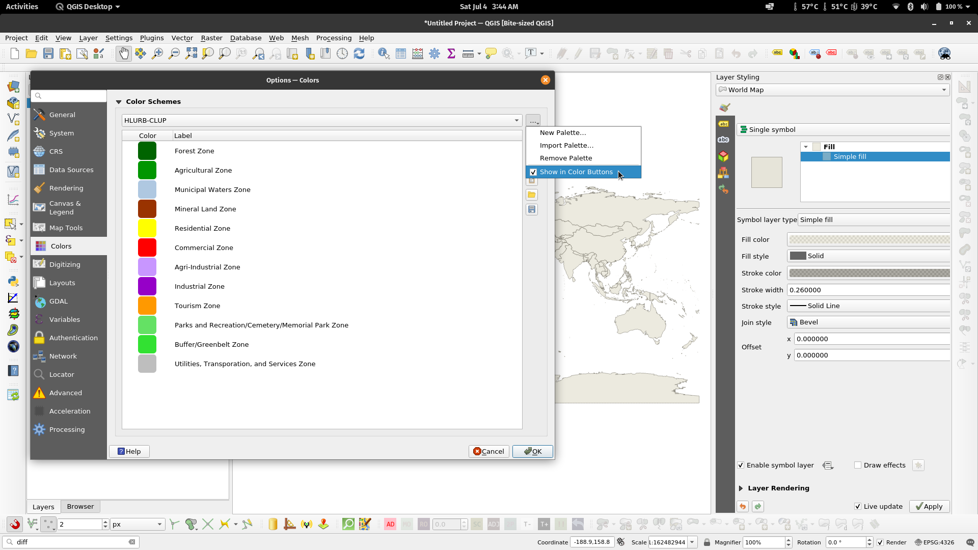
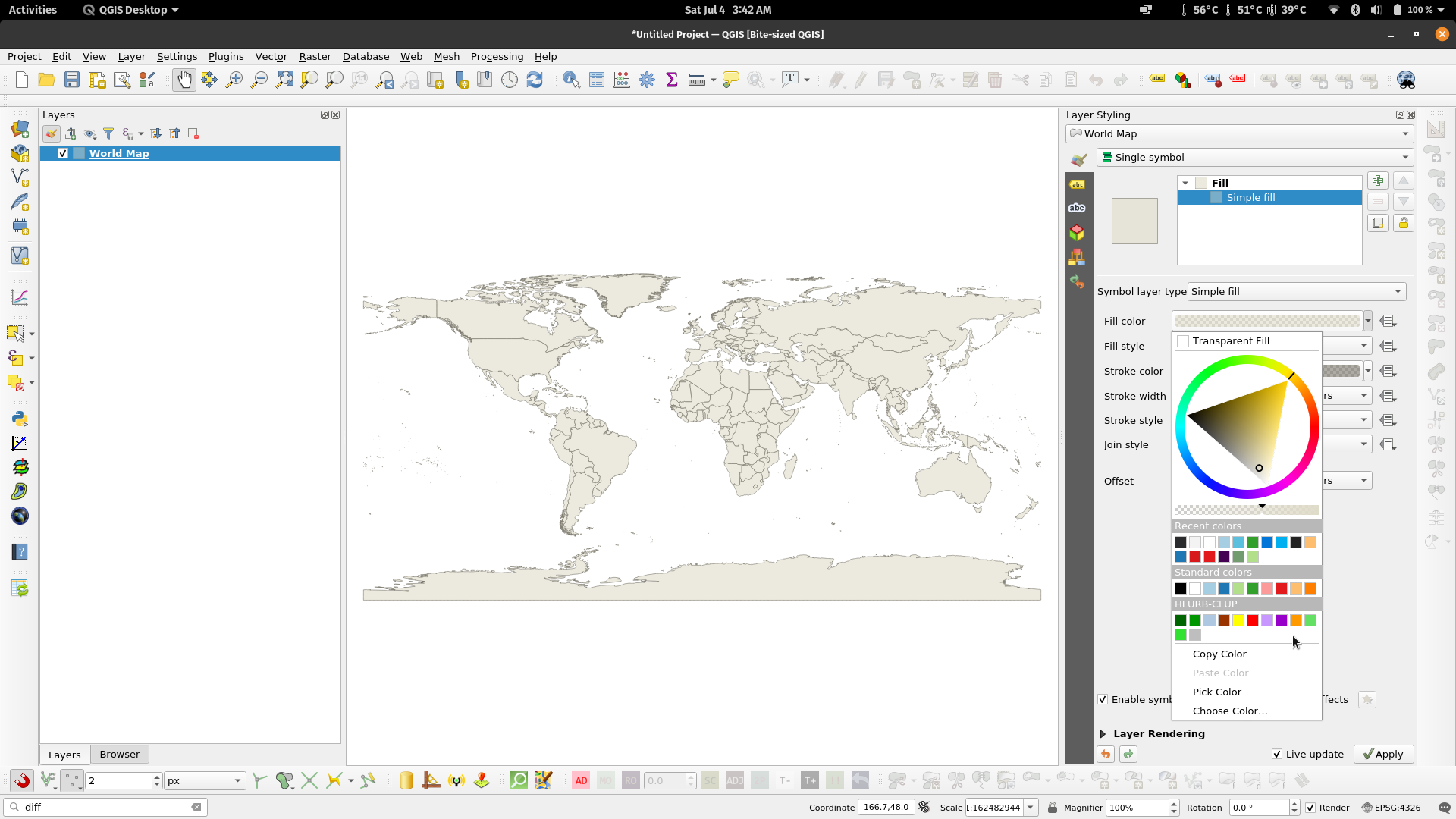
Figure 9. Show the palette in the QGIS Color Buttons Figure 10. The HLURB-CLUP color palette appearing in the QGIS color button/dialog | |
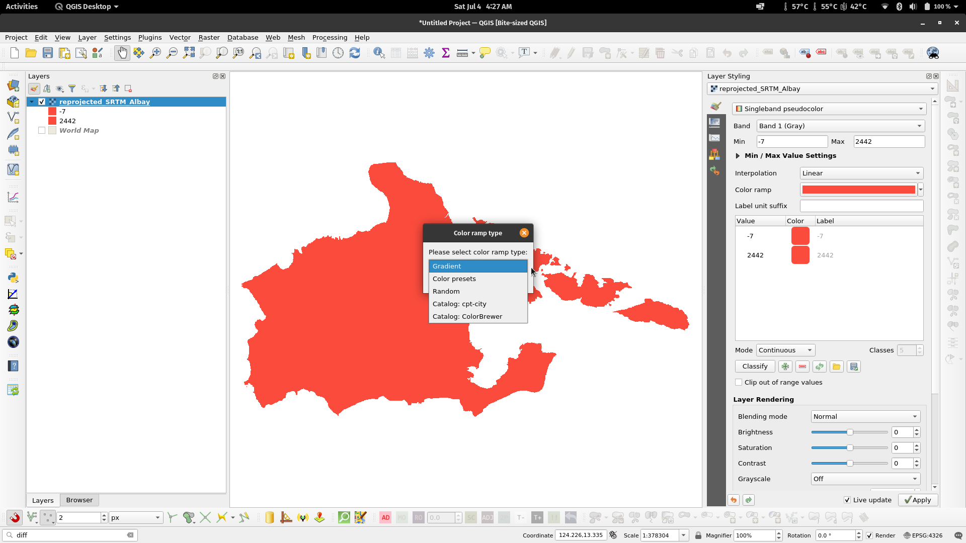
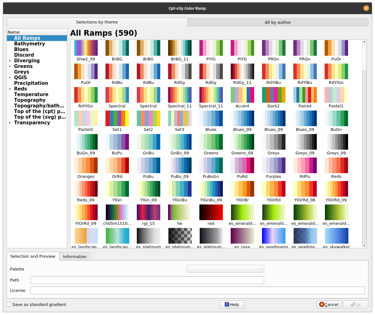
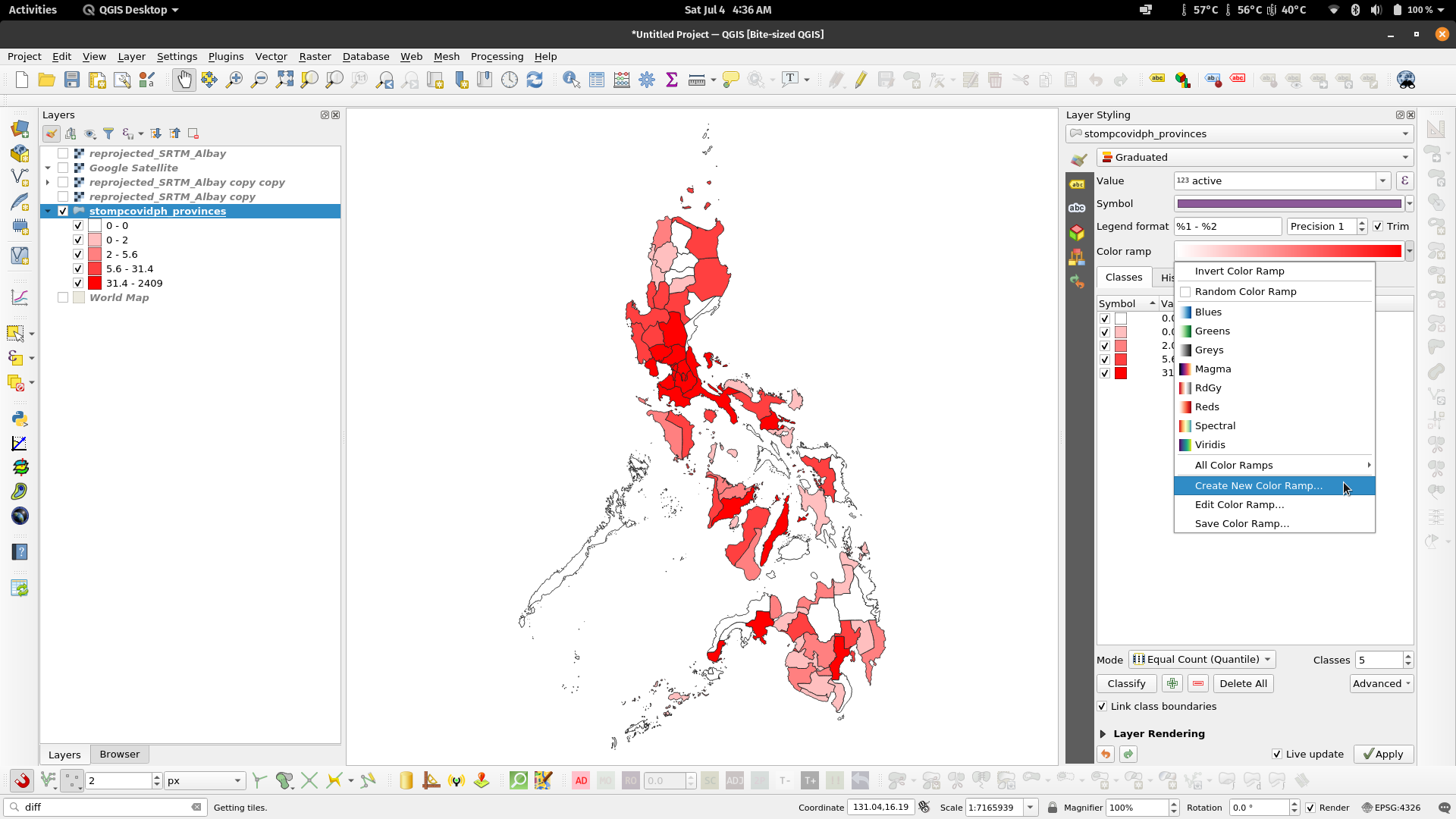
Color Palettes in QGISQGIS also has a lot of built-in color palettes to choose from aside from the ones shown when selecting color palettes in the color selection dialog (e.g. raster symbology). For example, QGIS has built-in cpt-city color palettes and even a palette creator using Color Brewer. This option can be found by clicking Create New Color Ramp… when a color ramp dialog is present. | |
Figure 11. Palette options in QGIS Figure 13. cpt-city color palettes in QGIS | Figure 12. Create New Color Ramp |
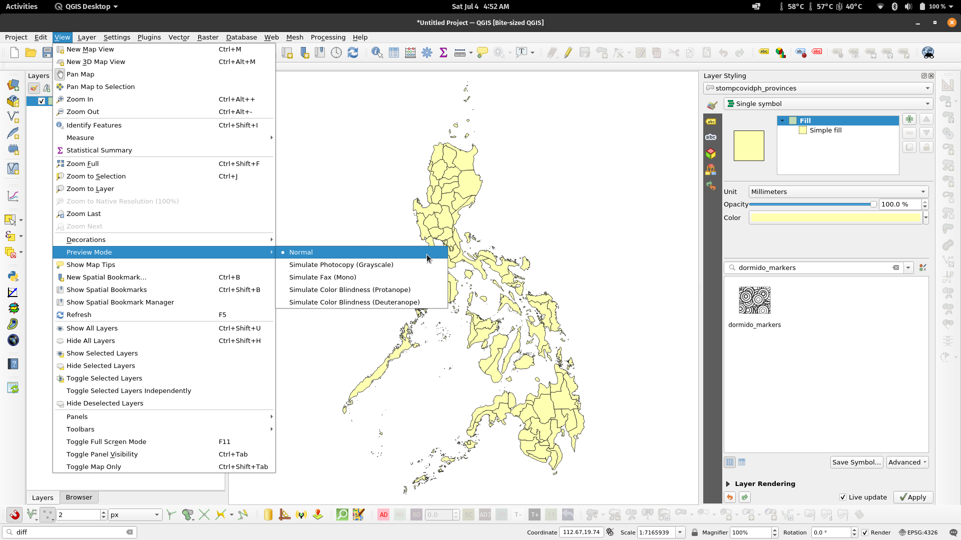
How would my maps look like when photocopied, faxed, or when viewed by a colorblind individualOne of the advantages of Color Brewer palettes in QGIS is that most of them are color blind safe. When selecting a color palette or color scheme for your maps, it is useful to make it as inclusive as possible in order to correctly relay information to the most people as possible. There are several applications that allow you to select and create inclusive color palettes. These include sites like the aforementioned ColorBrewer (https://colorbrewer2.org/) and Viz Palette (https://projects.susielu.com/viz-palette). In QGIS, you can use Preview Modes to see how your map would look like photocopied, faxed, or if viewed by someone with color blindness. This option can be found via View -> Preview Modes in the Menu bar. | |
Exercise 2: Previewing your maps in different modes
| |
| |
| |
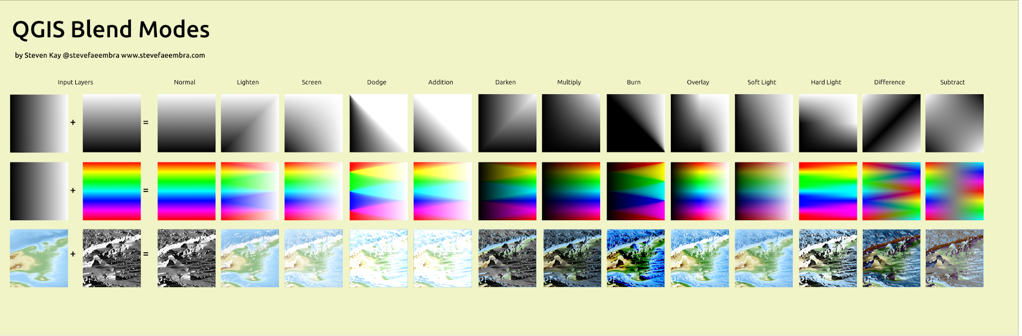
Blending ModesSImilar to graphics manipulation applications such as GIMP and Photoshop, QGIS has what’s called Blending Modes that allow for more sophisticated rendering between GIS layers. There are 13 blending modes which (aside from the Normal mode) can be divided into four groups. These modes are:
Blending mode properties are available for both vectors and rasters and can usually be found in the Layer Rendering part at the bottom of the Styling Panel (F7) or Layer Properties -> Symbology dialog. | |
QGIS Blend Modes by Steven Kay | |
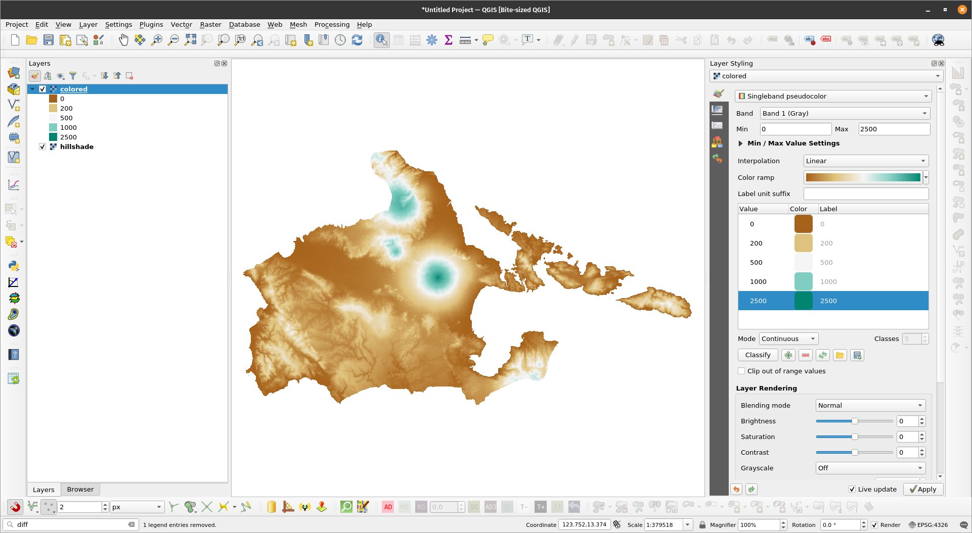
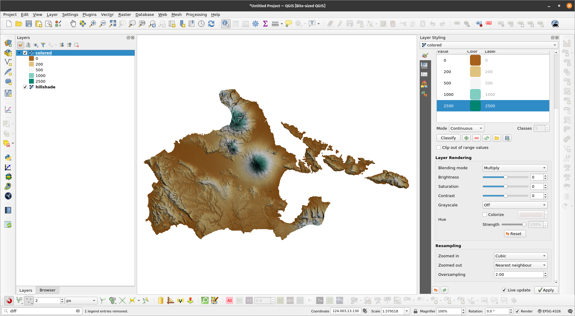
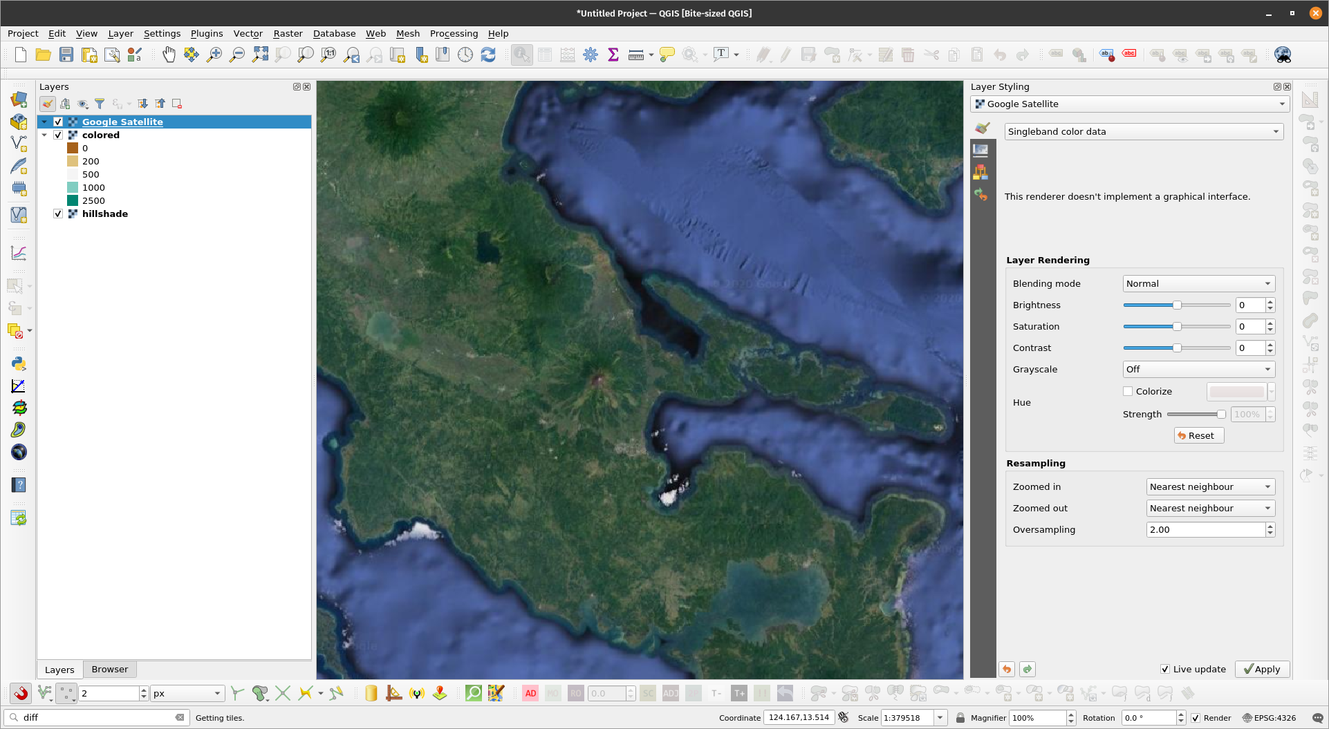
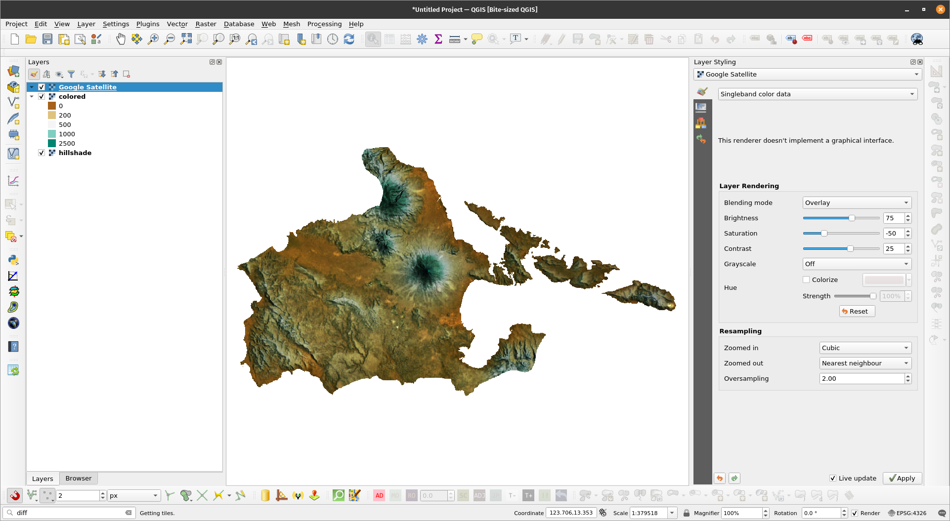
Exercise 3: Using Blend Modes to Style RastersIn this exercise, we’ll utilize the power of Blend Modes to style a raster similar to this post: https://bnhr.xyz/2019/01/22/hillshade-in-qgis.html
| |
Rasters loaded in QGIS | |
| |
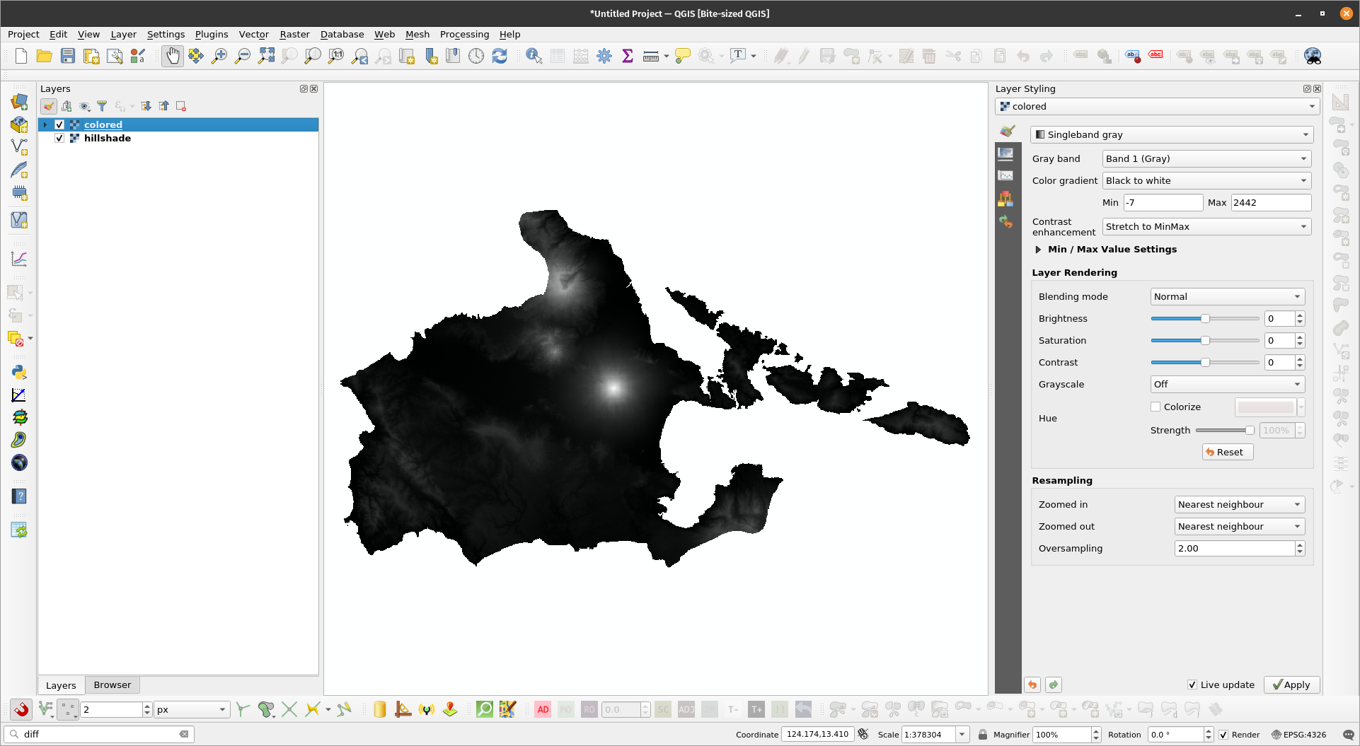
Hillshade layer styled | |
| |
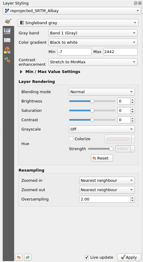
Colored DEM layer styled | |
| |
Combined colored and hillshade layer | |
| |
Satellite imagery loaded in QGIS | |
| |
Combined colored, hillshade, and satellite image layer | |
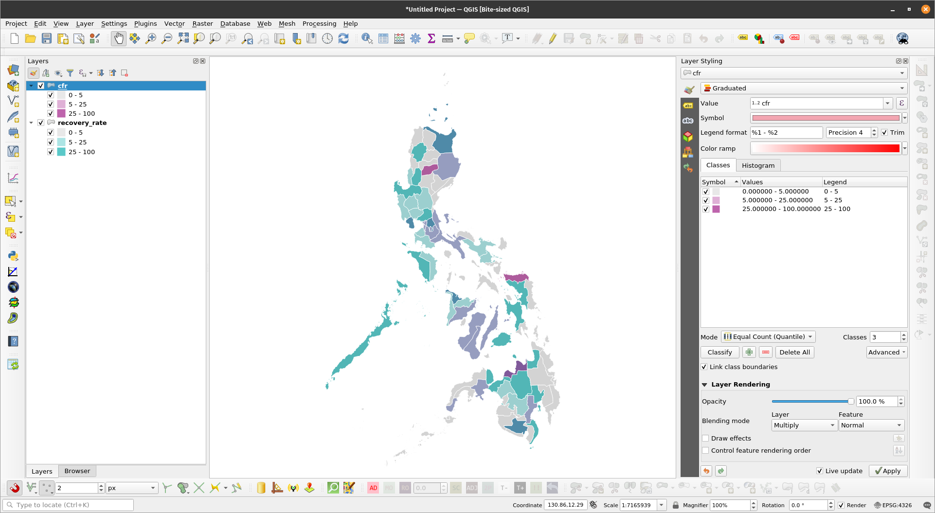
Bivariate choropleth maps in QGISBivariate choropleth maps are both stunningly beautiful and informative. With the right color combination, a bivariate choropleth map hits that sweet spot of being both visually stunning and highly informative. Exercise 4: Bivariate choropleth maps in QGISIn this exercise, we will create a bivariate choropleth map in QGIS similar to the one done in this post: https://bnhr.xyz/2019/09/15/bivariate-choropleths-in-qgis.html
| |
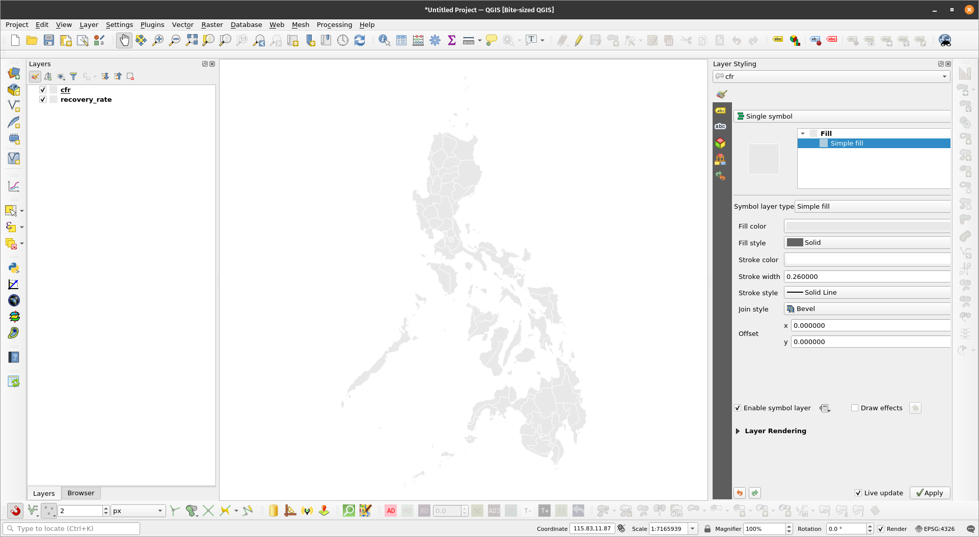
The cfr and recovery rate layers | |
| |
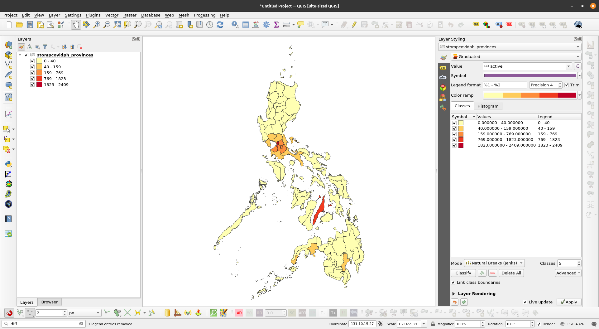
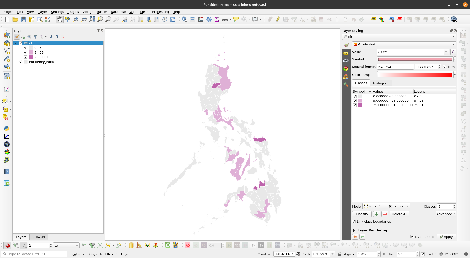
Choropleth of cfr layer | |
| |
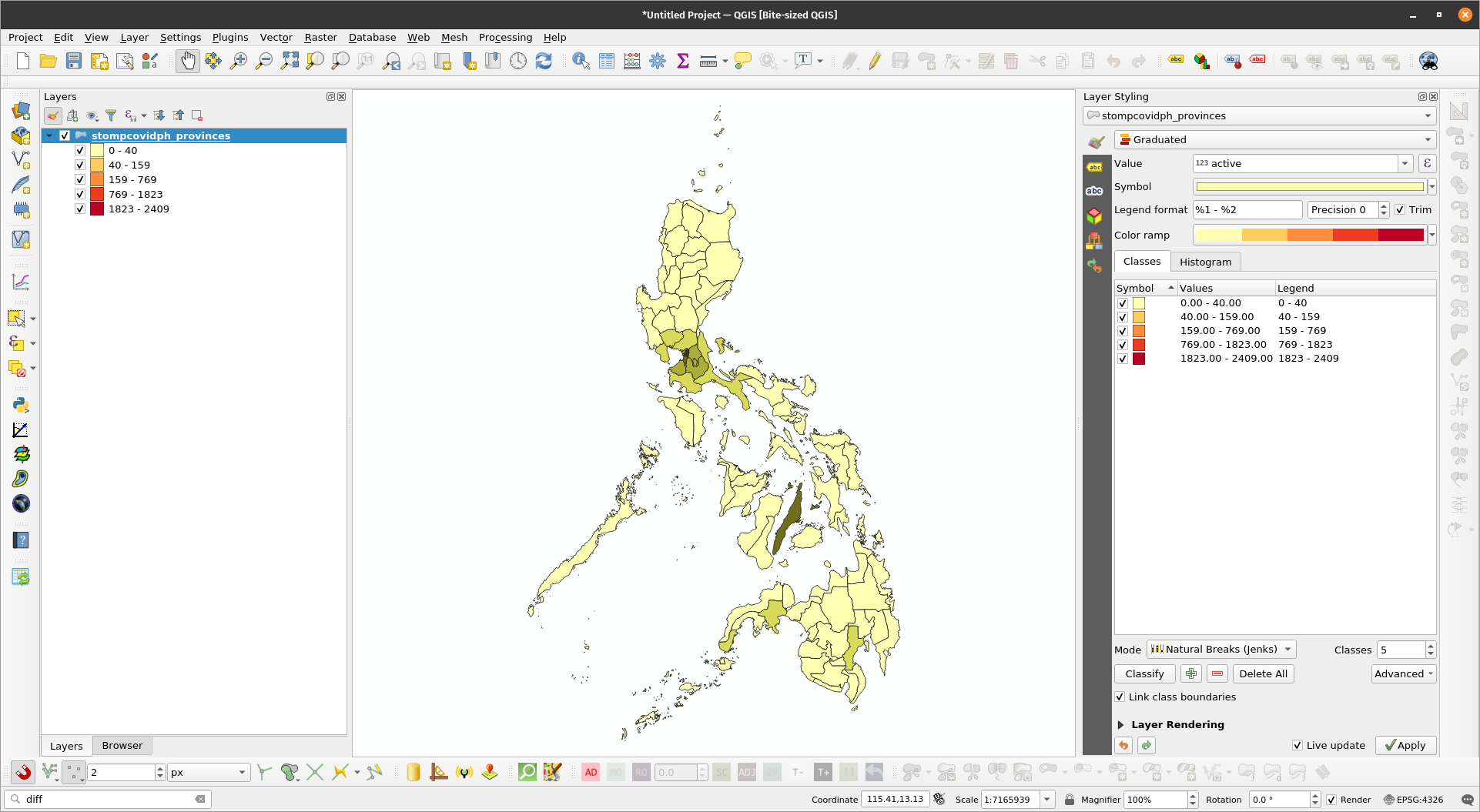
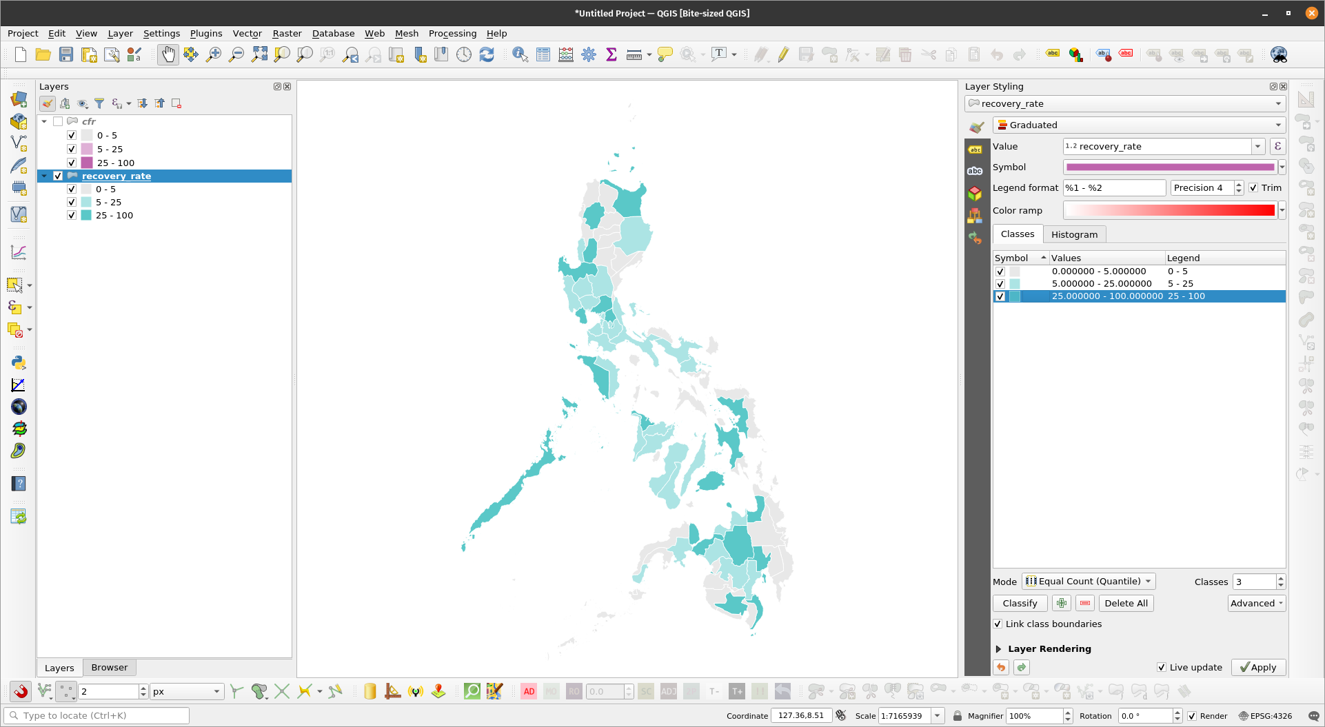
Choropleth of the recovery rate layer | |
| |
Bivariate choropleth of cfr & recovery rate | |
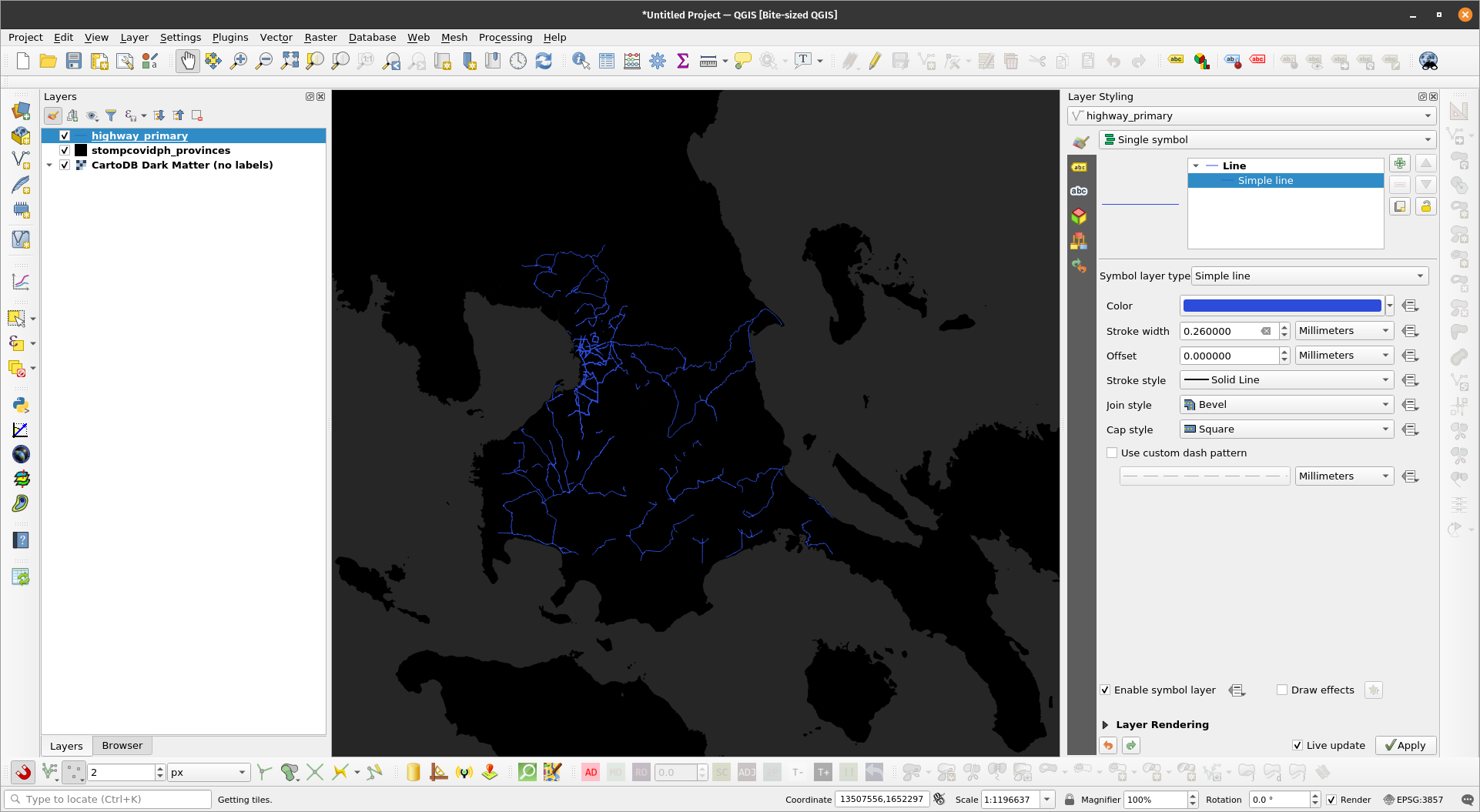
Emphasizing density with Feature-level blendingUsing blending modes on the feature-level is useful when we want to emphasize density (or de-emphasize sparseness). This is particularly useful for feature-rich datasets with multiple overlapping geometries such as roads. Exercise 5: Showing road density using feature-level blendingIn this exercise, we will highlight areas with dense road densities using a simple feature blending technique.
| |
The road layer looks dull and areas with dense road networks aren’t emphasized | |
| |
| |
Data-defined overridesData-defined overrides are powerful tools in QGIS. Through this mechanism, a user can use dynamic values for styling parameters such as color, size, rotation, etc. A data-defined override is available for a parameter when the button appears to its right. Clicking on the Data-defined override button reveals the different options available for the user. The override can be based on:
For an override to work, it must be in the same type as the value it is overriding. For example, a size parameter must be overridden by a number, a color parameter must be overridden by a string pertaining to a color. When a data-defined override is active, the button turns yellow . |
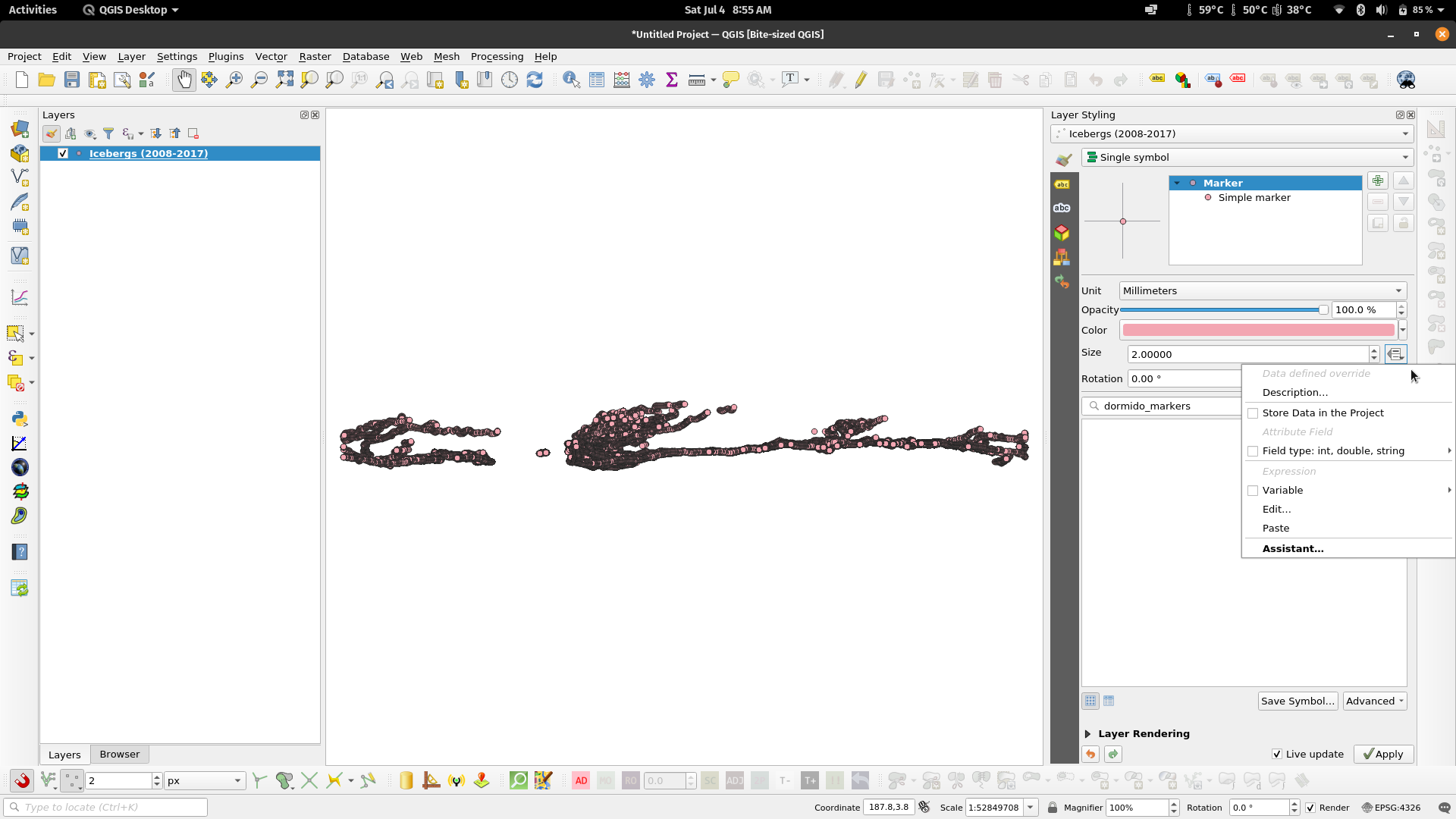
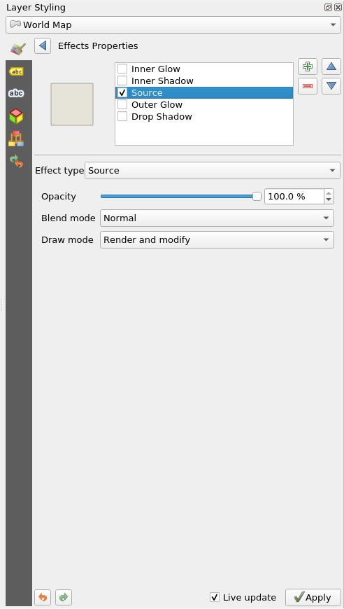
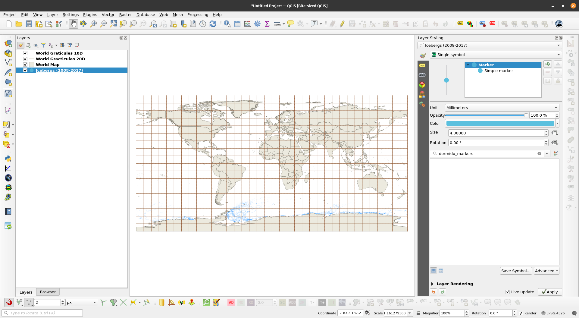
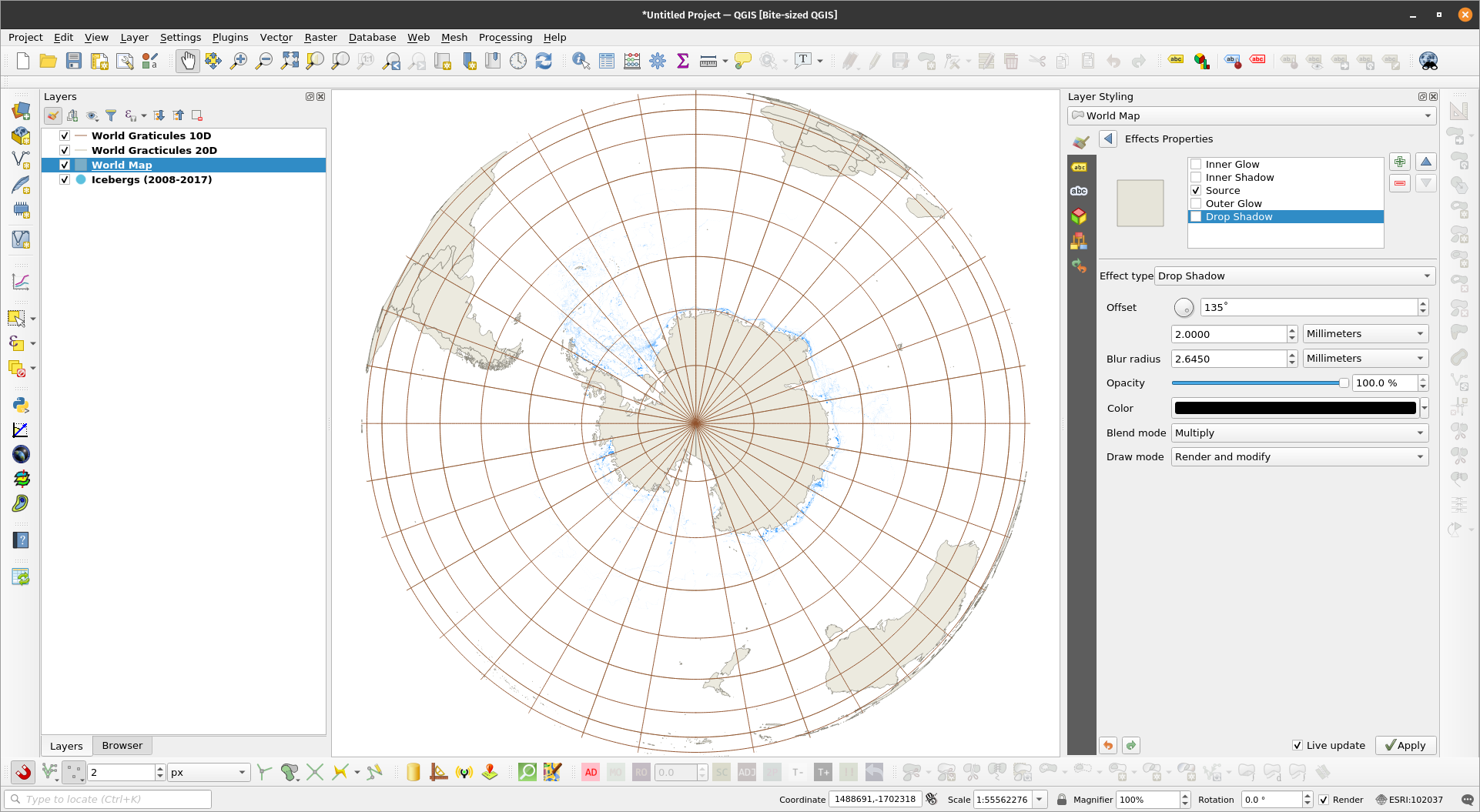
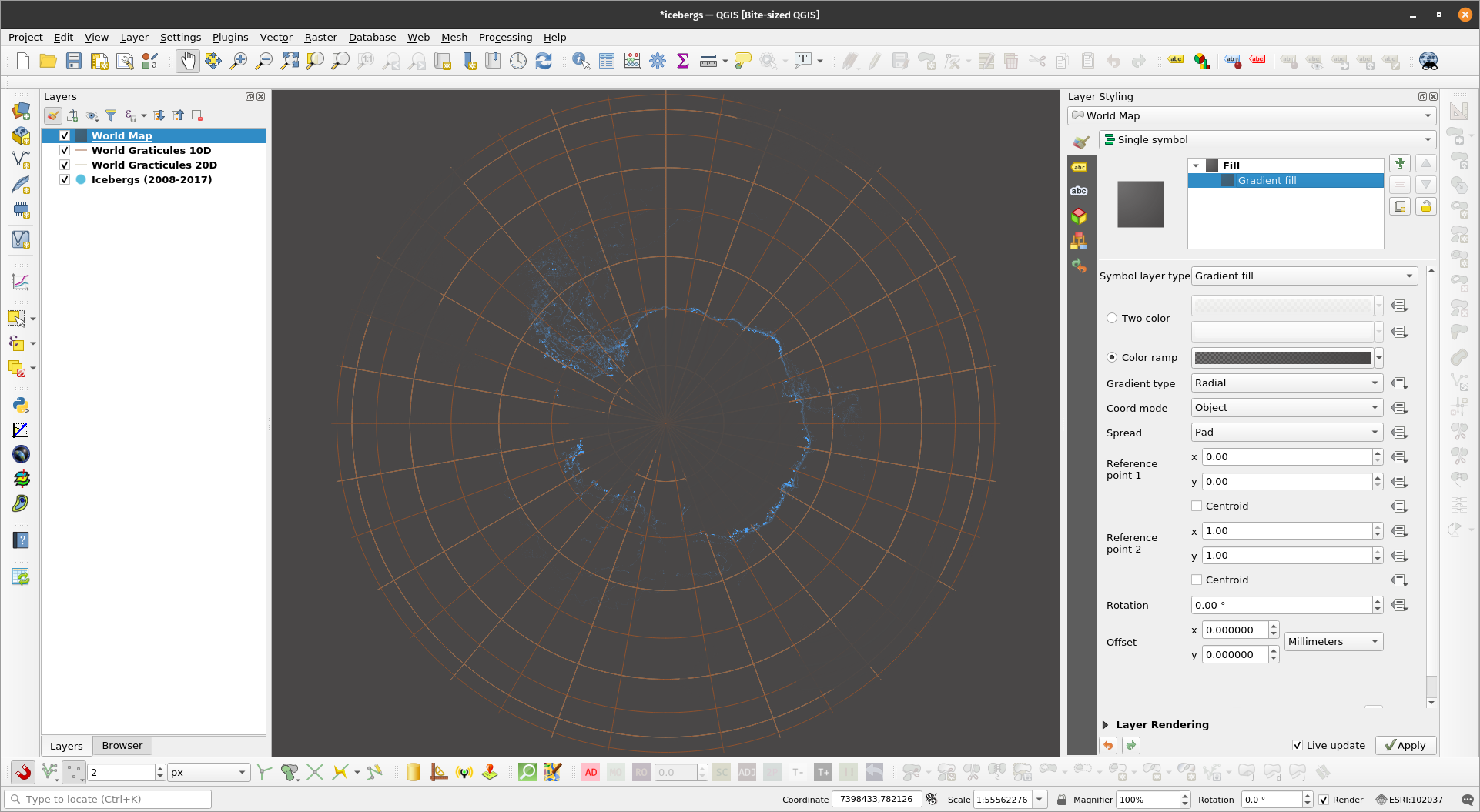
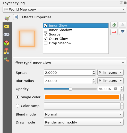
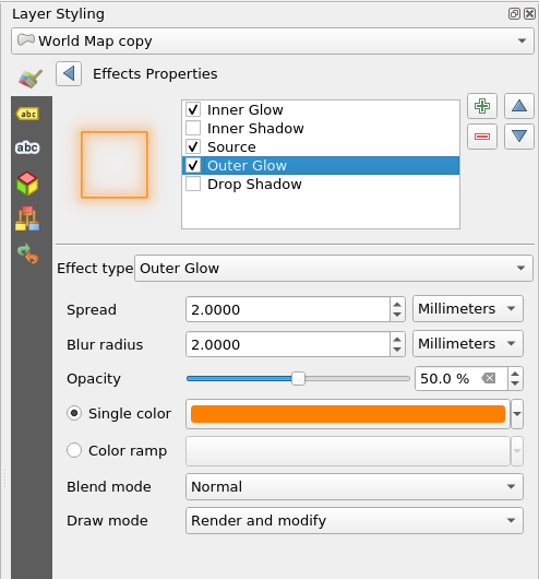
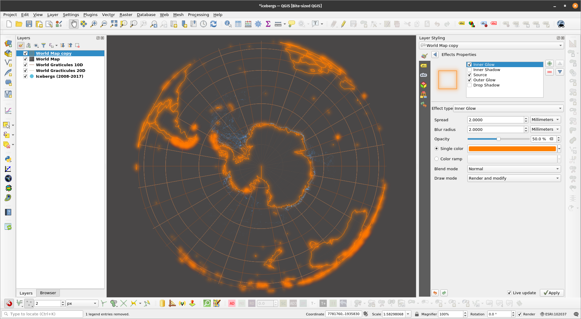
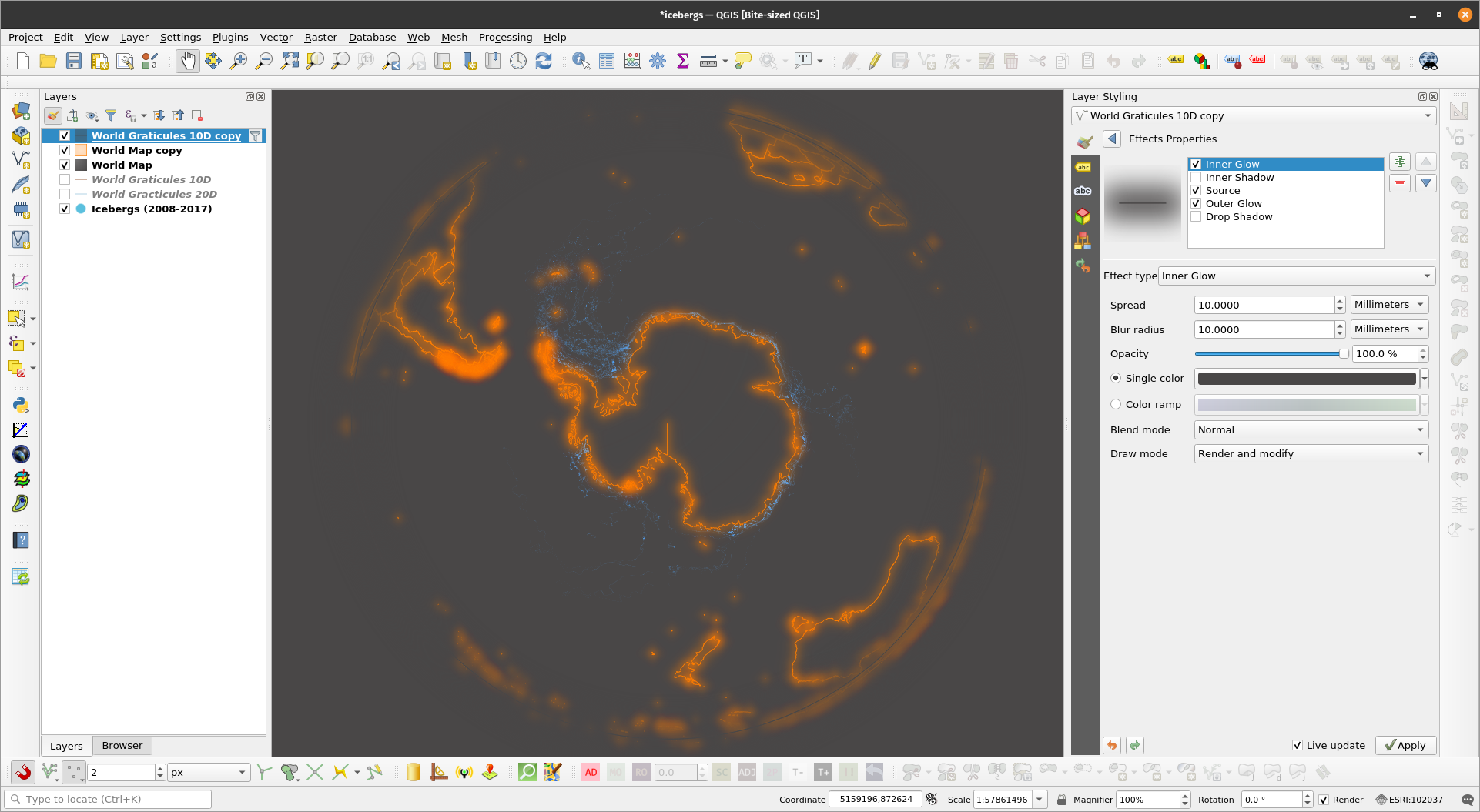
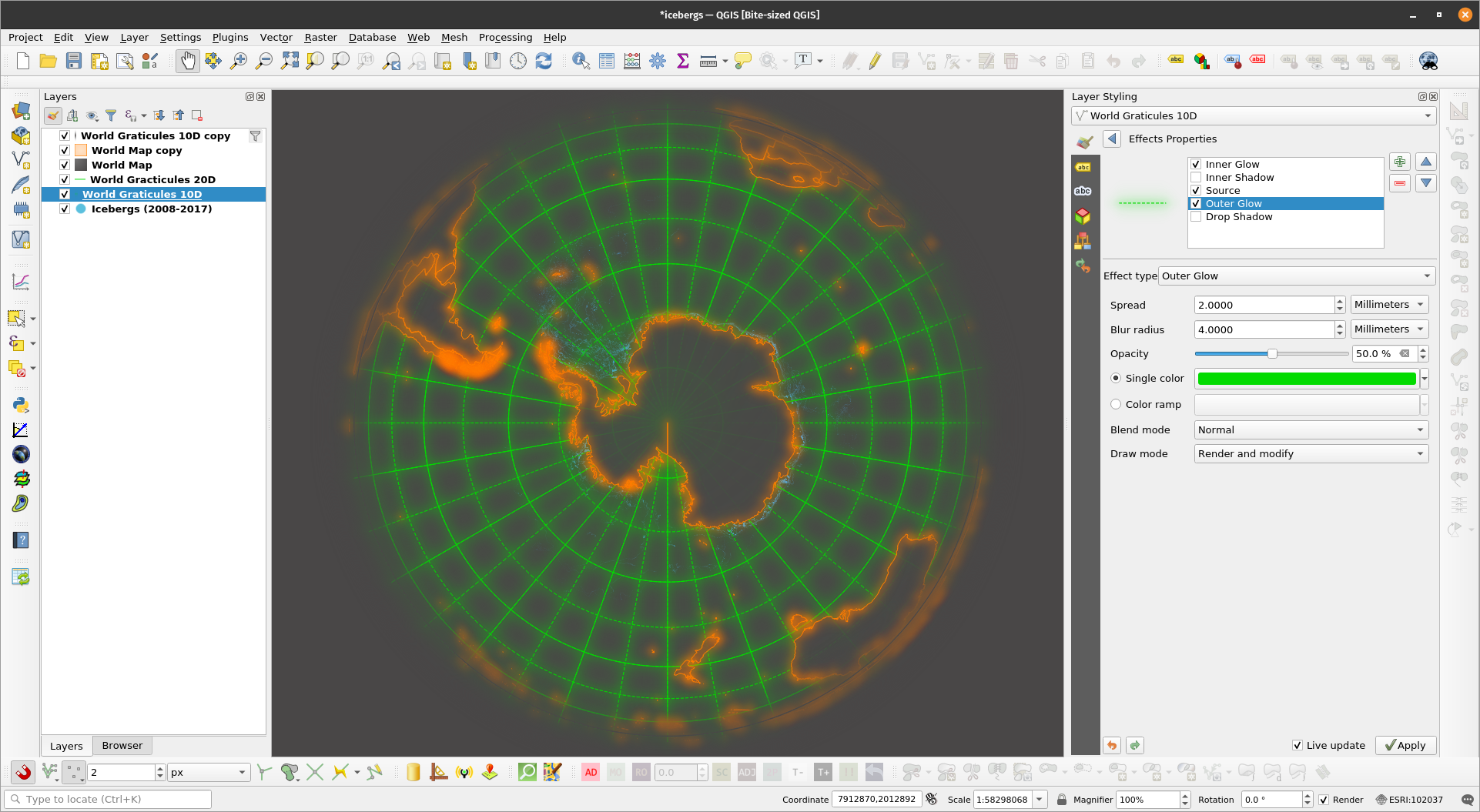
Draw effectsSince QGIS 2.10, draw effects have been available in QGIS that allows the user to modify and add different effects to the rendering of vectors. These effects can be activated and modified by enabling and clicking the draw effects button (star). The different effects available to the user are:
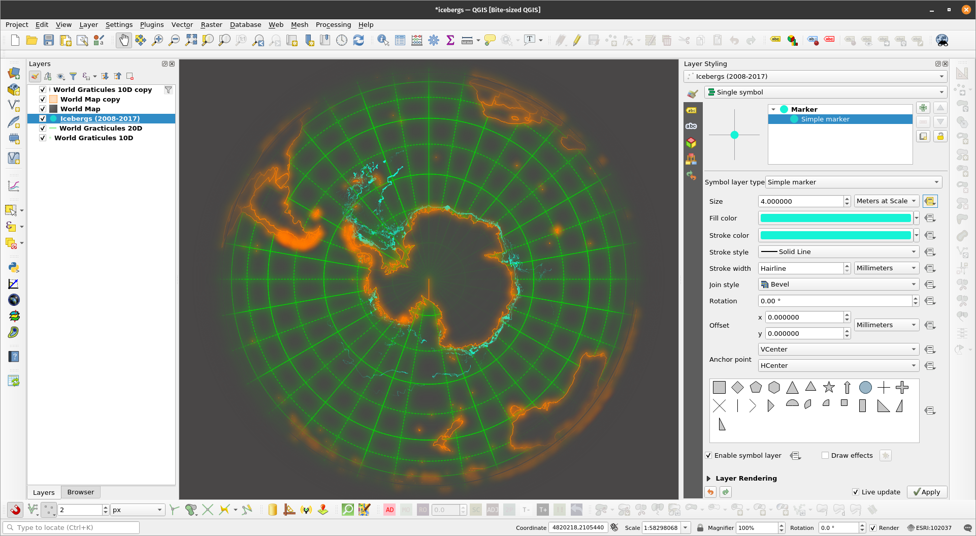
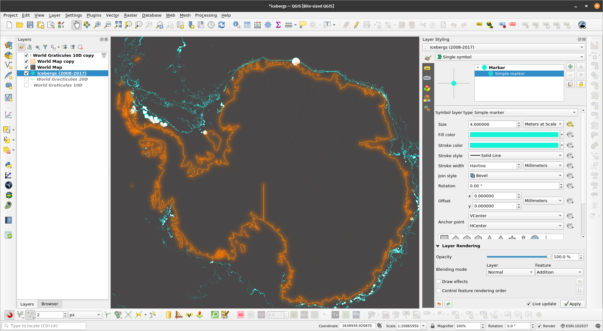
The opacity and blend mode can also be modified for each effect. The rendering order of the effects can also be changed via the arrow buttons. Draw effects are useful for adding glows and shadows to features and layers (i.e. firefly maps). Exercise 6: Mapping Icebergs in QGISIn this exercise, we will use data-defined overrides and draw effects to map icebergs in QGIS similar to this post: https://bnhr.xyz/2019/02/08/mapping-icebergs-in-qgis.html
| |
| |
| |
| |
| |
| |
| |
| |
| |
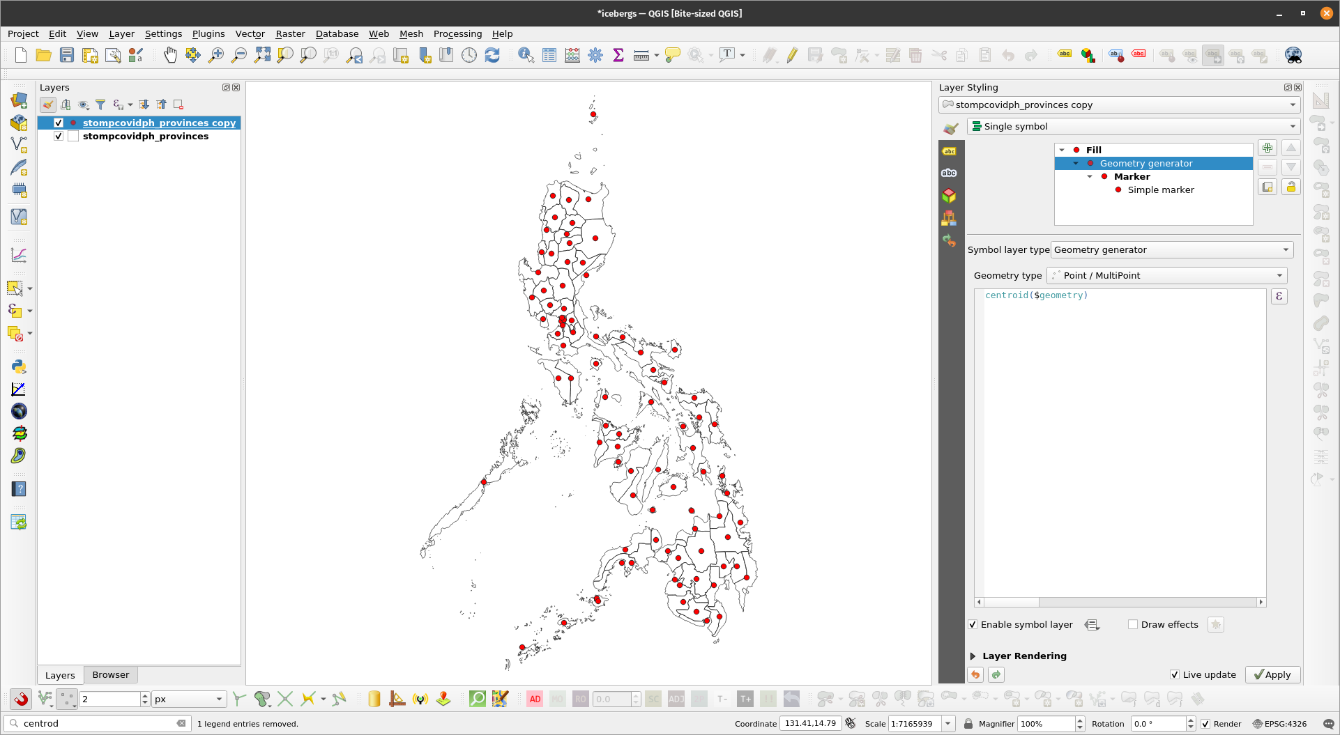
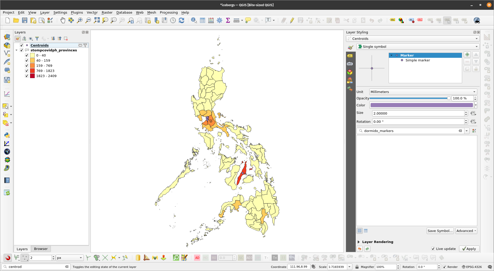
Geometry generatorsGeometry generators allow you to create new geometries using QGIS expressions and existing geometries. This means that we can create polygon, lines, and point geometries without the need for creating new layers. For example, you can generate a buffer geometry from a point layer or a centroid geometry from a polygon layer. Geometry generators also allow us to create complex geometries and styles. When working with geometry generators, it is important to remember that the correct geometry type has to be set in order for the geometry generator to work. For example, if the final geometry is a point (e.g. centroid) select Point/Multipoint as the geometry type. If it is a polygon (e.g. buffer), select Polygon. Exercise 7: Generating centroids and buffers using geometry generatorsIn this exercise, we will generate centroids and buffers using geometry generators.
| |
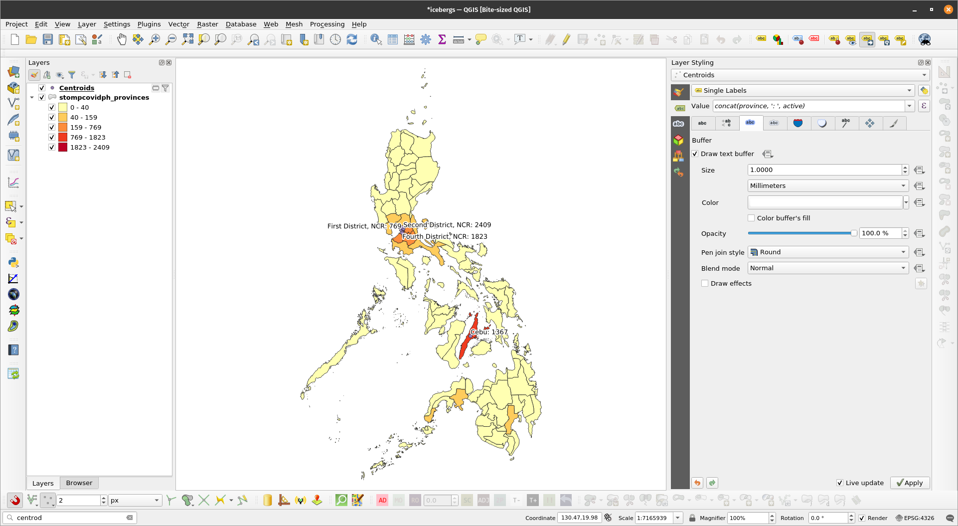
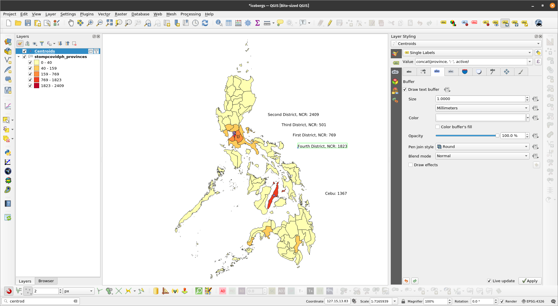
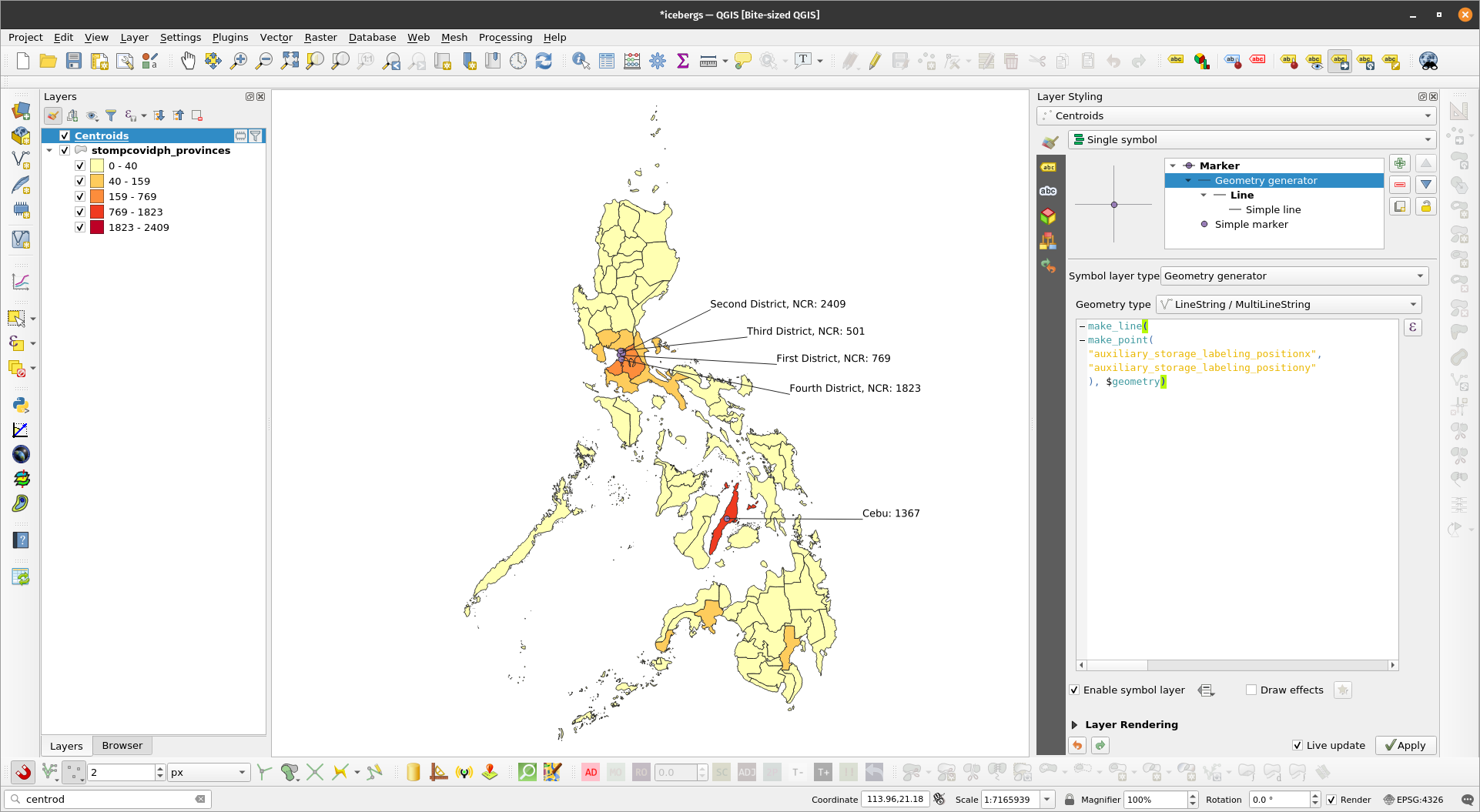
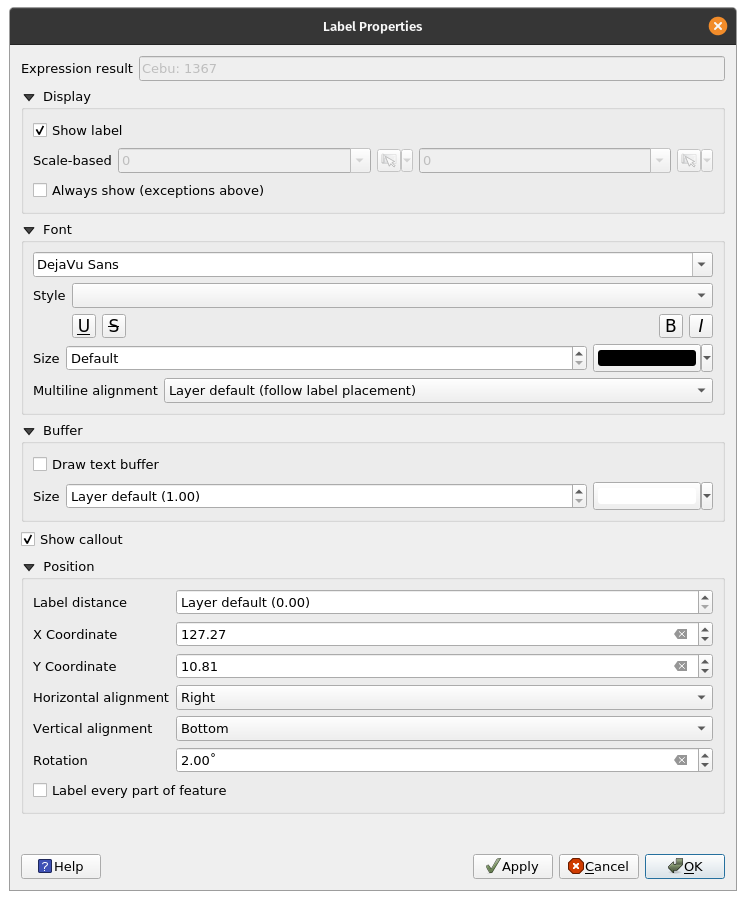
Labels in QGISQGIS has a very mature and customizable label mechanism. Data-driven overrides, QGIS expressions, and even geometry generators can be used when labelling. Another feature of labels in QGIS is that they can be moved manually anywhere on the map canvas. Exercise 8: Basic Labelling with Leader Lines
| |
| |
| |
make_line( make_point( "auxiliary_storage_labeling_positionx", "auxiliary_storage_labeling_positiony" ), $geometry) | |
| |
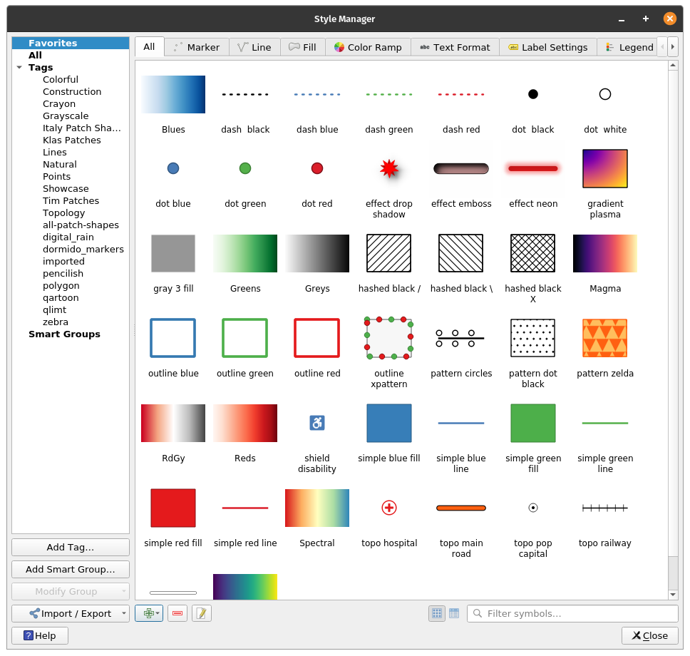
The QGIS Style Manager allows the user to manage different style components of QGIS. It can be accessed via Settings -> Style Manager in the Menu bar. | |
QGIS Style ComponentsIn the Style Manager, the user can find the different styles for points (markers), lines, polygons (fills), color ramps, text formats, label settings, and legend patches. Using the Style Manager allows the user to have reusable and consistent style components. A style can be created once, stored in the style manager, and used multiple times. The Style Manager also allows for sharing of styles between different users so one user can create a style and share it with others to use. | |
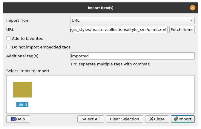
Importing Styles into the Style ManagerDIfferent style components can be imported into the style manager either as files or as URLs. Once imported, these styles then become available for use inside QGIS. Exercise 9: Importing Styles into QGISFor this exercise, we’ll be importing the wonderful QGIS styles made by Topi Tjukanov (@tjukanov) available from https://github.com/tjukanovt/qgis_styles.
| |
| |
BNHR | This work and its contents by Ben Hur S. Pintor is licensed under a Creative Commons Attribution-NonCommercial-ShareAlike 4.0 International License. |